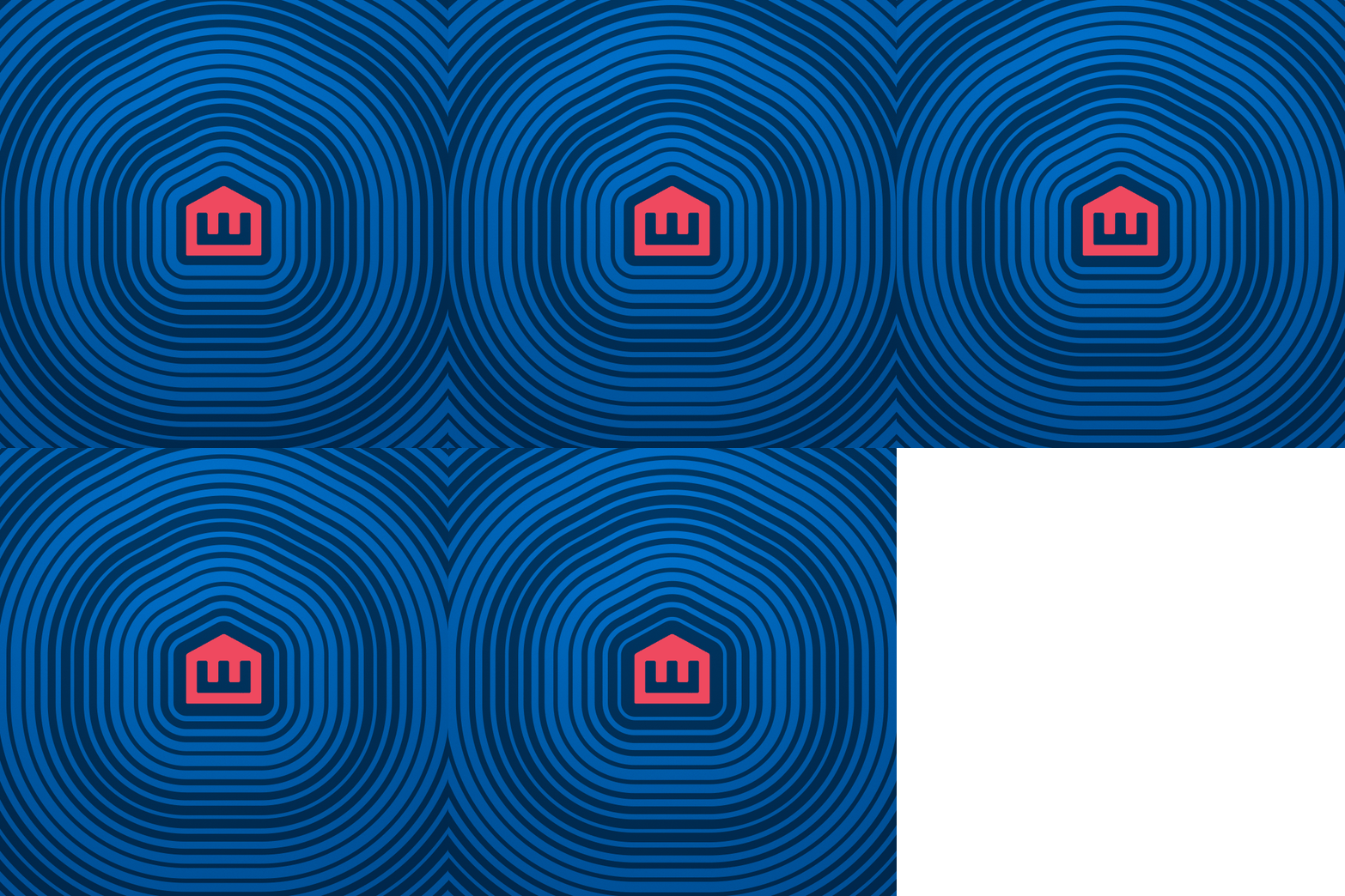


In 2017, Emmaus House, a nonprofit in Peoplestown, Atlanta, was approaching its 50th Anniversary and had never had a formalized brand.
During our brand exploration, we identified three key principles that resonated with Emmaus House: neighborhood, growth, and progress. We brought these to life in the logo: a simple home encompassing an E, making it a reference to the community and a literal and figurative representation of Emmaus House, and the subtle nod to an arrow, used to indicate upward or forward movement; growth or progress.
We established a new visual identity and tone of voice, providing consistency across all marketing channels and preparing Emmaus House for the next 50 years.
We were honored to bring home the 2018 AMY Award for Visual Identity/Brand — B2C for our client.


